 by michael daigle · 9 Jan 2024
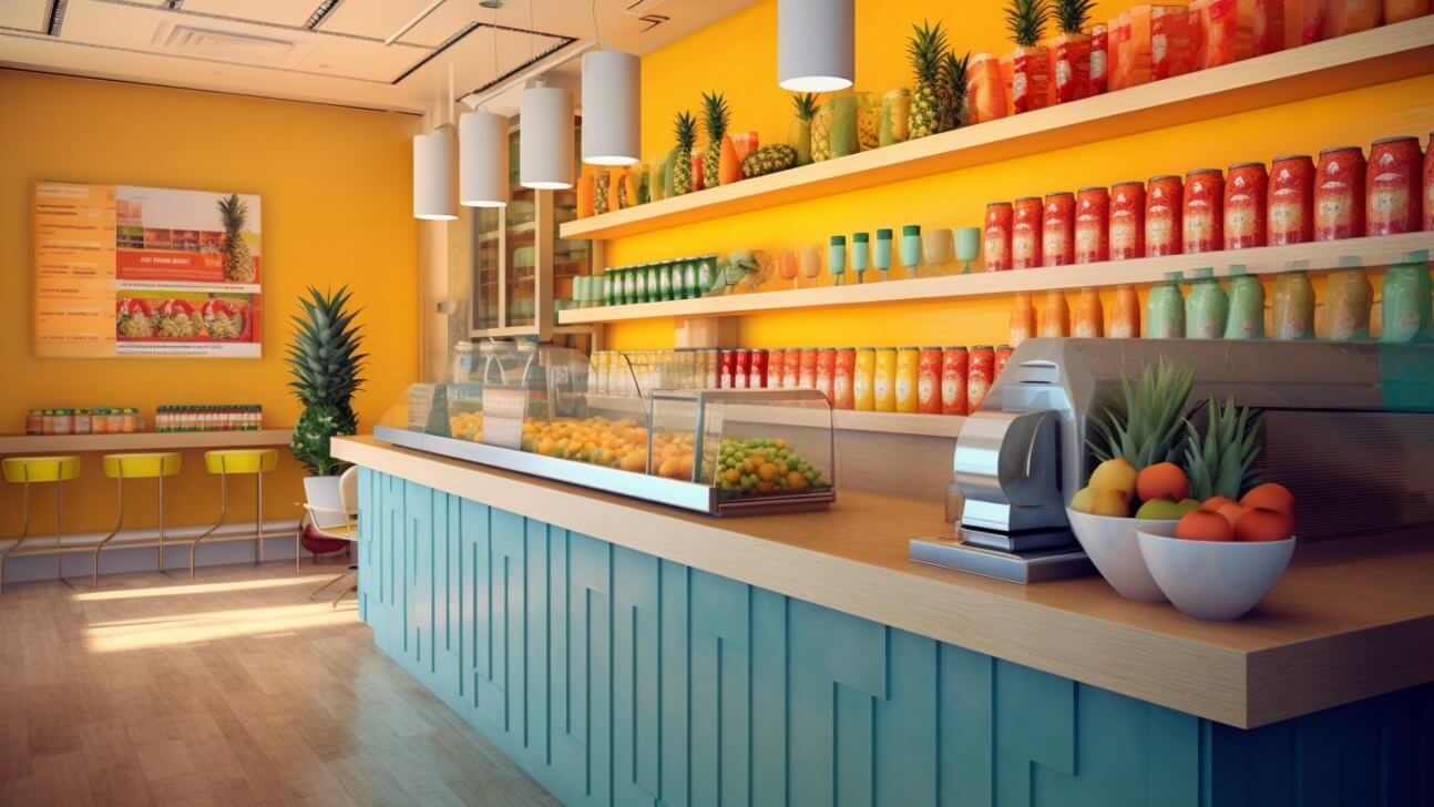
Table of Contents
Ever wonder why stores are decorated in certain colors? It's not just for esthetics. Retailers put a lot of thought into the colors they use because colors have a psychological impact on customers and influence behavior. They can attract your attention, ignite your emotions, and even encourage sales.
You walk into a store and the vibrant red walls immediately energize you. Your heart beats a little faster and you feel excited. The store seems lively and upbeat. You end up staying longer and buying more than you intended. The red walls were strategically chosen to produce that energizing effect to keep you shopping. The colors in retail spaces are not by accident. They are carefully designed to influence how you feel, act, and shop.
Introduction to the Psychology of Color in Retail
The colors you choose for your retail space directly influence how customers feel and behave. Understanding the psychology of color can help create an environment where people want to browse, shop, and buy.
The Power of Warm Colors
Reds, oranges, and yellows are warm colors that stimulate excitement and energy. Using them in a retail space can:
- Increase impulse purchases as customers feel a sense of urgency.
- Make the shopping experience feel lively and vibrant.
- Raise customers' heart rates and respiration, causing them to make quicker decisions.
The Calming Effect of Cool Colors
Blues, greens, and purples have a soothing, calming effect. They are ideal for:
- Relaxing customers and slowing their pace.
- Giving the impression of quality and trustworthiness.
- Promoting customer satisfaction and loyalty.
Combining Colors for the Best Effect
Using a complementary color scheme with warm and cool colors maximizes contrast and visual interest. For example:
- Red and green for a festive holiday store.
- Blue and orange for a creative decor boutique.
- Yellow and purple for an imaginative children's store.
By thoughtfully selecting colors, you can set the right mood, influence how long customers shop, and drive their purchasing decisions. The power of color in retail design is subtle but significant, so put in the work to determine how different hues can support your business goals. The investment in your space and customer experience will pay off.
The Meaning Behind Common Retail Colors
When you walk into a store, the colors around you are subtly influencing how you feel and shop. Retailers carefully choose color schemes to evoke certain moods and behaviors in customers.
The Meaning Behind Common Retail Colors
Red is a bold, energetic color that stimulates excitement and urgency. Retailers often use red to highlight sales or clearance items they want you to snap up quickly.
Blue is a calming, trustworthy color. Many stores use blue in their branding and decor because it puts customers at ease and builds confidence in the retailer.
Yellow is cheerful and optimisitc. Shades of yellow can lift your mood and encourage browsing. Stores that want customers to linger may incorporate yellow into their design.
Green symbolizes growth, wealth, and renewal. Natural food stores and outdoor retailers frequently use green to convey freshness and connect with their eco-conscious customer base.
Orange is a warm, vibrant color that boosts mood and appetite. Restaurants, cafes, and food retailers may use orange in their color schemes to stimulate customers' senses and hunger.
The colors in a retail space are never an accident. Whether you realize it or not, they are working on your emotions and influencing how you shop. The next time you're in a store, take a moment to notice the colors around you. They just might reveal insights into the retailer's strategy and customer experience goals.
Using Color to Influence Customers' Moods
The colors you use in your retail space can have a significant impact on your customers' moods and buying behaviors. Choosing the right color palette is crucial for creating an environment that encourages people to browse, shop and make purchases.
Red
Red is an energetic, exciting color that stimulates appetite and passion. Use red accents in a restaurant, bar or nightclub to raise energy levels and encourage social interaction. Red also attracts attention and is associated with urgency or sale items, so use it sparingly for promotions or clearance racks in any retail store.
Blue
Blue is a calming, trustworthy color. Use shades of blue in a retail space to make customers feel at ease and receptive. Light or bright blues work well for most retail environments. Navy or dark blue can also give a space a feeling of quality or authority.
Green
Green symbolizes nature, growth and health. It has a relaxing, rejuvenating effect. Use green in a retail space selling organic or natural products. Shades of teal or seafoam green give a fresh, modern feel that appeals to eco-friendly customers.
Yellow
Yellow is an optimistic color that stimulates creativity and happiness. Use yellow to brighten up a space and lift people's moods. However, too much yellow can be overstimulating, so use it sparingly, especially on walls. Yellow works well for a casual, playful brand or in a children's store.
Neutral Colors
Neutral colors like gray, beige and brown create a comfortable space for people to shop and make considered purchases. Use lighter neutrals on walls with wood accents for a warm, natural feel. Pair neutral walls with bright accent colors to add visual interest without overwhelming customers. A neutral color scheme appeals to the widest range of shoppers.
The colors and color combinations you choose for your retail space directly impact your customers' experience and buying behavior. Select a color palette that aligns with your brand personality and makes people feel good while shopping. With the right colors, you'll turn more browsers into buyers.
Warm vs. Cool Color Schemes in Retail Design
Warm colors like red, orange and yellow are energizing and stimulating. They evoke warmth, excitement and cheerfulness. In retail spaces, warm color schemes are great for attracting attention and stirring up energy and enthusiasm.
Red
Red is an intense, vibrant color that attracts attention and stimulates alertness and action. Used in retail, red encourages impulse buying and grabs customers’ focus. It is ideal for highlighting sales or promotions. However, too much red can seem aggressive or irritating. Red works well when balanced with cooler colors.
Orange
Orange combines the energy of red and the cheerfulness of yellow. It is an appealing, friendly color that lifts moods and sparks warmth. In retail design, orange attracts attention while creating a playful, spirited atmosphere. It gives the impression of activity and social interaction. Orange also stimulates appetite, so works well in restaurants or grocery stores. However, too much orange may seem unprofessional or chaotic.
Yellow
Yellow is the color of sunshine and happiness. It makes people feel optimistic and brightens spaces. In retail, yellow creates an uplifting, airy feel and attracts attention in a cheerful, inviting way. It is ideal for stores targeting younger shoppers or promoting an affordable, casual image. However, too much yellow can seem distracting or cheap. Pale yellows are more sophisticated and work well with neutral tones.
Cool colors like blue, green and purple have a calming, relaxing effect. They evoke feelings of peacefulness, trust and security. In retail, cool color schemes establish a serene, orderly environment where customers feel at ease to browse and shop. The use of warm and cool colors together provides visual contrast and a vibrant atmosphere. Finding the right balance of warm and cool tones for your retail space depends on the image you want to project and types of customers you aim to attract.
Choosing Accent Colors to Stand Out
Choosing accent colors in your retail space is a great way to make your brand stand out. Vibrant pops of color attract attention and create visual interest that keeps customers engaged.
Complementary colors
Colors opposite each other on the color wheel, like blue and orange or red and green, are complementary colors. Using complementary accent colors creates high contrast that energizes a space. Place accent walls, furnishings or decor in complementary colors to make a bold statement.
Triadic color scheme
A triadic color scheme uses three colors equally spaced on the color wheel, like red, yellow and blue. Triadic accents provide harmony and balance. Use one triadic color on each wall of a room for a cohesive look, or incorporate triadic accents throughout a space.
Tetradic color scheme
A tetradic color scheme combines four colors in a square or rectangle on the color wheel, such as red, orange, green and blue. Tetradic accents can be vibrant, but also busy. Limit tetradic colors to smaller accents like throw pillows, rugs, artwork or other decor. Or, choose a primary and secondary color for larger elements like walls and use the remaining colors sparingly.
warm or cool accents
Accenting with either warm (red, orange, yellow) or cool (blue, green, purple) colors creates a cohesive temperature scheme. Warm accent colors stimulate and create energy, while cool accents relax and soothe. Choose warm or cool accents based on the mood you want to evoke.
Using intentional accent colors in your retail space helps create an memorable experience for customers. Combine different color schemes or stick with a single scheme for a cohesive look. Update accent colors seasonally to keep your space feeling fresh. Most importantly, choose accent colors that reflect your brand's personality and the experience you want customers to have.
Complementary Color Combos for Visual Interest
When designing a retail space, the colors you choose can have a significant psychological impact on customers and influence their behavior. Using complementary color combinations is an easy way to make a space visually interesting while also guiding how people interact with the environment.
Red and green
The contrast between red and green is highly visually appealing. Red attracts attention and stimulates excitement, while green relaxes customers and promotes a sense of harmony. Using red on accent walls or for product displays will draw interest, then incorporating green elements for seating areas or plants provides a balanced, calming space for browsing.
Blue and orange
The complementary colors of blue and orange create a vibrant look. Blue is associated with trust and security, so use it for large walls or in a store’s logo and branding. Pops of bright orange, such as on product packaging or small furnishings, energize the space and encourage customer interaction and impulse buys. This lively, complementary color combo is ideal for a youthful brand.
Yellow and purple
Cheerful yellow and luxurious purple are an unexpected color pair that dazzles the senses. Yellow stimulates happiness and optimism in customers, so use it around entryways to make a welcoming first impression. Deep purples on accent walls or in soft furnishings and lighting cultivate a sense of wealth and sophistication. This duo is perfect for a boutique selling high-end goods.
Using these complementary color combinations in your retail space, you can establish the right mood, highlight products, designate areas for different activities, and guide how customers move through the environment. But be careful not to overdo it, as too much color contrast can feel jarring or chaotic. For the most visually cohesive look, choose a dominant color for large areas like walls, then use the complementary shade for accents and details. Finding the right color balance will make a bold statement and positively influence your customers’ experience.
Color Contrast Strategies to Guide the Eye
Color contrast is a powerful tool for guiding customer attention and influencing behavior in retail spaces. By strategically using complementary colors in your store design, you can:
- Draw attention to key areas. Place colors that contrast with the overall color scheme to highlight focal points like product displays, signage or promotional offers. The contrast will capture interest and pull the customer's gaze.
- Create visual paths. Use a series of contrasting colors to map a path through the space that leads customers to important elements or a desired end point. The contrasts create a visually compelling flow that most people will follow unconsciously.
- Set a mood. Contrasting colors can be used to evoke certain moods or emotions in customers. Warm colors like red and yellow create energy and excitement while cool colors like blue and green are more calming. Use color to match the tone you want to set.
- Accentuate architecture. Color contrast applied to structural elements like columns, archways or staircases helps to define the space and make the architecture a design feature. The contrasts will draw attention and make a statement.
Some examples of effective color contrast strategies:
- Red accent walls or product displays in a space with a neutral color scheme. The bold red pops and instantly captures interest.
- A yellow brick road - a pathway through the space defined by a series of yellow focal points like signage, lighting, floor decals or product groupings. The yellow contrasts guide customers on a journey.
- Blue ceiling and walls with orange furnishings and decor accents. The complementary blue and orange color scheme creates visual drama and an energetic vibe.
- Painting support columns a bright color that contrasts with the surrounding walls. The columns become a focal point and help define the open space.
Using strategic color contrasts in your retail design is a subtle yet powerful technique for influencing customer flow and behavior. The contrasts attract attention, guide movement and set the perfect mood to keep shoppers engaged.
Developing a Cohesive Brand Color Palette
Developing a cohesive brand color palette is key to influencing customer behavior through color psychology in your retail space.
- Start by determining your brand personality and the emotions you want to evoke. Energetic and exciting? Calming and trustworthy? The colors you choose should align with and strengthen your brand identity.
- Focus on your target audience. The colors that appeal to teens and young adults may differ from an older clientele. Know who your core customers are and what colors they are drawn to.
- Consider cultural associations. Colors have different meanings across cultures. Make sure your color palette takes into account the cultural diversity of your customer base.
- Determine a color scheme. Having a color scheme, like analogous, complementary or triadic creates harmony. An analogous color scheme uses adjacent colors on the color wheel, complementary uses opposite colors, and triadic uses three colors equally spaced on the wheel.
- Choose a primary color. Your primary color should dominate and represent your brand. Accent colors are used to complement and highlight your brand.
- Test your color palette. See how people respond to your color palette through surveys and focus groups. Get feedback and make adjustments as needed to achieve the effect and emotions you want.
- Use color strategically. Place your primary brand color in key areas like signage, product displays and walkways. Use accent colors to draw attention to new products or sales. Vary shades of colors for the best effect.
- Evaluate and revise. Review how customers respond to your color palette over time. Make changes to keep your brand image fresh and appealing.
A well-developed brand color palette is a powerful way to create a memorable customer experience, influence purchasing decisions and build brand loyalty. Put in the work upfront to determine a cohesive color palette that achieves your brand goals and resonates with your target audience. With regular evaluation and refinement, your color palette can have a big impact on customer behavior and your bottom line.
Final Thoughts
So the next time you walk into your favorite store, pay attention to the colors around you. Notice how the shades make you feel and how they subtly influence what you notice and buy. Retailers have mastered the art of using color to drive our purchasing decisions. Knowing the psychology behind their color choices helps you become a more mindful shopper. You can appreciate the thought that went into the design and layout, all intended to maximize your experience. At the same time, awareness gives you more control over what catches your eye. Use this knowledge to your advantage the next time you need a little retail therapy!