 by michael daigle · 9 Jan 2024
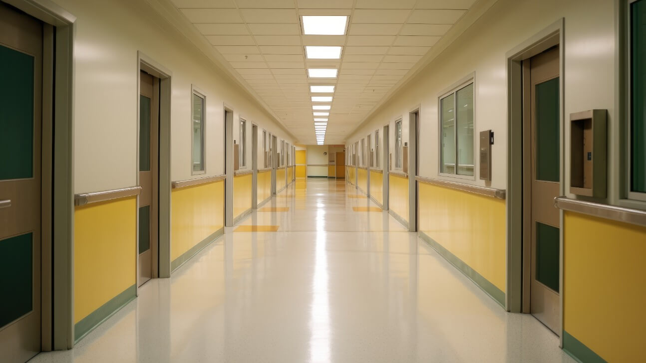
Table of Contents
Have you ever walked into a restaurant or hotel lobby and felt an instant mood boost? Chances are the space was designed with colors that evoke certain emotions and experiences. Color is one of the most powerful tools in hospitality design. As designers and business owners, it's crucial we understand how to harness the power of color to create memorable and impactful spaces.
The colors we surround ourselves with directly impact our mood, stress levels, and perception of time. Reds and oranges spark energy and excitement. Blues and greens evoke calmness and tranquility. Yellows lift our spirits and enhance creativity. The list goes on. By choosing a color palette that aligns with your brand and the experience you want to create, you can subtly influence how people interact with your space.
The next time you're designing a new hotel, restaurant, or lounge, think about the emotions and reactions you want to elicit from your guests. Then, let color be your guide. The impact will be felt for years to come in the memories people associate with your space. Color is a hospitality designer's secret weapon, so use it wisely!
The Psychology of Color in Interior Design
The colors you choose for your hospitality design can have a big impact on how customers feel when they walk through your doors. The psychology of color is a powerful influencer.
The Power of Red
Red evokes feelings of excitement and passion. Using red accents in your lobby or dining area creates energy and stimulates conversation. However, too much red can seem aggressive or angry, so use it sparingly, especially in areas meant for relaxation.
Blue for Calm
Shades of blue, especially lighter blues, are soothing and calming. Blue tones in a hotel lobby or lounge help guests feel peaceful and comfortable. Blue is also an appetite suppressant, so avoid using it in dining rooms or you may find customers don’t linger over meals.
Welcoming Yellow
Yellow is associated with happiness, optimism and friendliness. A splash of yellow at a restaurant entrance or front desk gives customers an instant warm and sunny welcome. However, yellow can also trigger feelings of anxiety or frustration in large doses, so use a pale, buttery shade in moderation.
Natural Green
Green represents nature, renewal and harmony. Different shades of green, from sage to seafoam, can make a space feel balanced and tranquil. Use natural greens in lounges, spas or outdoor patio areas. Deep forest greens may feel too dark and depressing for many hospitality settings.
By thoughtfully incorporating color into your hospitality design, you can craft an environment that makes your customers feel good and want to return again and again. Focus on using warmer colors at entrances and front desks, cooler colors in relaxation zones and always keep the psychology of color in mind. The right colors can turn your space into a feel-good destination.
Choosing Colors for Hotel Lobbies and Common Areas
Choosing the right colors for your hotel lobby and common areas can make a big impact. The colors you select set the tone and help create an inviting space for guests.
- Warm colors like reds, oranges and yellows evoke feelings of warmth, comfort and energy. Using warm tones in a lobby can make it feel cozy and stimulate social interaction. Add accent walls or feature elements in warm colors to make a statement.
- Cool colors such as blues, greens and purples are calming and relaxing. Incorporating cool tones into a lobby design helps guests unwind and de-stress. Consider cool colors for lounge areas, seating arrangements and decorative accents.
- Neutral colors are versatile and work with any style. Tans, creams, light browns and grays provide a blank canvas you can build on. Use neutral walls in a lobby as a base and add color through furnishings, art, plants and lighting fixtures.
- Natural materials also help bring warmth into a space. Wood, stone, greenery and natural light are inviting for guests. Include living walls or lots of potted plants, wood furniture and flooring, rock or stone accent walls and ample windows.
- Pay attention to lighting and include a mix of natural and artificial light. Chandeliers, pendant lights, table and floor lamps placed around the lobby at varying heights create visual interest and a welcoming glow. Dim lighting in the evenings helps set a relaxing mood.
With the thoughtful use of color, natural materials and lighting, you can design a hotel lobby that makes a great first impression and sets the perfect tone for an enjoyable stay. Choose a cohesive color palette and decorative touches that reflect your hotel's unique style and brand. Your guests will appreciate the inviting atmosphere.
Using Color to Create a Warm, Inviting Restaurant Atmosphere
The colors you choose for your restaurant's interior design have a significant impact on the atmosphere and how inviting it feels for customers. Using a warm color palette evokes feelings of comfort and warmth.
Reds, Oranges and Yellows
Colors like red, orange and yellow are energetic and stimulate appetite and conversation. Having accent walls or decorative elements in these hues creates a cozy, casual vibe perfect for a restaurant.
- Red is an intense, passionate color that attracts attention and raises energy levels. Use it sparingly, such as for a feature wall.
- Orange evokes excitement and optimism. Consider orange tabletop accents, chairs or pendant lighting.
- Yellow inspires happiness and creativity. A yellow-themed bar or booth area would make a cheerful statement.
Wood Tones
The natural warmth of wood also makes a restaurant feel homey and cozy. Incorporate wooden tables, chairs, flooring, paneling, bar tops or ceiling accents. The organic quality of wood helps strike a balance with more vibrant accent colors.
Lighting
Strategic lighting plays a key role in creating atmosphere. Dimmer, more ambient lighting makes spaces feel more intimate while bright task lighting helps with practical needs. A mix of natural and artificial light sources at various intensities provides flexibility.
Textiles
Plush textiles like thick tablecloths, upholstered seating, rugs and draperies also convey warmth. Consider a color palette of rich burgundies, forest greens, tawny browns and burnt oranges. Textured fabrics like velvet, corduroy or chunky knits enhance tactile appeal.
By combining warm colors, natural materials and layered lighting, you can design a restaurant interior that envelops guests in coziness. A welcoming atmosphere filled with sensory delights will have customers coming back again and again. Focusing on warmth and hospitality is key to creating an inviting restaurant space your guests won’t soon forget.
Color Trends in Hospitality: What's Hot Right Now
Bold and bright colors are popular in hospitality design right now. Vibrant shades of red, orange and yellow are being used in hotels and restaurants to create an energetic, playful vibe.
- Red is a stimulating, appetite-inducing color that attracts attention. Many fast casual restaurants are using red accents, lighting, and signage. Red walls or decorative elements give dining rooms a stylish, passionate feel.
- Orange evokes warmth, cheerfulness and creativity. Boutique hotels and vacation rentals often use orange in living rooms, bedrooms and outdoor spaces to establish a bright, fun atmosphere. Burnt orange and terracotta are natural, earthy takes on this spirited color.
- Yellow is associated with happiness, optimism and spontaneity. Lobbies, cafés and patios are utilizing yellow furniture, art, planters and other decor to cultivate a sunny, carefree ambiance. Pale yellows, like lemon or buttercup, create an uplifting yet mellow vibe.
Blue and green shades are also popular, especially in eco-friendly and wellness-focused properties. Calming, natural tones give guests a sense of peace and tranquility. Neutral, minimalistic color palettes remain timeless but are often punctuated with a pop of color for visual contrast.
Lighting also plays an important role in color trends. Colored LEDs, neon signs, string lights and table lamps allow designers to subtly tint spaces, highlight architectural details or make a bold statement. When used together, color and lighting create an immersive experience that leaves a lasting impression.
The colors and lighting strategies hospitality brands choose significantly impact a guest's mood and experience. By staying on top of trends, hotels and restaurants can craft spaces that feel fresh, stylish and inviting. But timeless, natural tones will always have a place, providing comfort through familiarity. Ultimately, the most memorable spaces strike a balance between what's trendy now and what will endure.
Color Considerations for Hotel Rooms and Suites
The colors you choose for your hotel rooms and suites have a significant impact on guests. The right palette creates an inviting space that makes people want to stay longer. But the wrong colors can make a room feel cramped, dark, or uncomfortable.
Consider the Purpose
Think about the main use of the room. Calming colors like blues and greens are ideal for bedrooms, while energetic shades of red or yellow suit a dining area or living room. Neutral colors that provide flexibility are always a safe bet for multi-purpose spaces.
Account for Lighting
The available natural lighting in a room also affects how colors are perceived. North-facing rooms with little direct sun may require warmer tones to prevent a cold, dreary feel. South-facing rooms can handle bolder colors since abundant light will brighten the space. For windowless rooms, aim for lighter shades that make the area appear more open and airy.
Coordinate With Furnishings
harmonizing colors with the room’s furnishings and fabrics creates a cohesive look. If the furniture features dark wood and leather, pair it with deeper jewel tones. For lighter pieces, stick to pastel or muted shades. And for a minimalist space with little ornamentation, a neutral base color lets accent colors on accessories and linens provide pops of color.
Consider Trends
While timeless, neutral colors are always in style, trendy shades can give rooms a modern edge. Watching color trend forecasts in interior design publications helps you stay on the cutting edge. Just be sure to avoid anything too loud or unconventional, which risks alienating some guests. Subtle takes on the latest colors are the safest approach for hotels.
The art of choosing colors for hospitality design is finding the right balance between excitement and calm, trendiness and timelessness. When in doubt, keep things simple but stylish. Your guests will appreciate a comfortable space where they feel at home.
Coordinating Color Schemes Throughout a Hotel or Restaurant
Coordinating colors throughout a hotel or restaurant helps to create a cohesive brand and memorable guest experience. Carefully choosing a color palette for walls, furnishings, decor accents, lighting, flooring and more will make the space feel intentionally designed.
Walls & Ceilings
The colors you choose for walls and ceilings set the overall tone for a space. Neutral base colors like off-white, light gray or beige work well for creating an open, airy feel. You can then add accent walls in bolder hues to draw attention to key areas or help with wayfinding. For ceilings, stick with lighter shades so the space still feels open and not closed in.
Furnishings & Decor
From couches and chairs to tables, drapes and artwork, coordinating colors for furnishings and decor will make a space feel polished and put together. Pick a color palette with 2-3 main colors and use 60-70% of your pieces in those core hues. Add in accent colors for the remaining pieces to create visual contrast. Group pieces together by color for maximum impact.
Flooring
The color and material used for flooring should complement your wall and furnishing colors. Hardwood floors in warm, medium-toned stains work well with a range of decorating styles. Neutral-colored carpets, tile, stone or vinyl in grays, tans and browns also pair nicely with most color schemes. For high-traffic hospitality spaces, durable and low-maintenance flooring options in coordinated colors are best.
Lighting
Don’t overlook lighting when choosing your color palette. The temperature or correlated color temperature(CCT) of your lighting impacts how paint and furnishing colors appear to the eye. Warmer lighting around 2700K complements reds, oranges and yellows while cooler lighting around 6500K works better with blues and greens. Using dimmable fixtures lets you adjust the brightness and mood. LED bulbs provide bright, energy-efficient lighting in a range of color temperatures.
Coordinating all these elements through color helps give hotels, restaurants and other hospitality businesses a stylish, put-together look that leaves a memorable impression. With some upfront planning, you can create spaces that feel cozy, vibrant, natural or dramatic using an impactful yet cohesive color scheme.
Matching Color to Your Hospitality Brand Personality
The colors you choose for your hotel or restaurant directly impact your guests’ experiences and perceptions. Selecting a color palette that aligns with your brand personality is key.
Are you an upbeat, vibrant brand? Bright colors like red, orange and yellow are energetic and eye-catching. They stimulate excitement and spark creativity. For a chic, sophisticated vibe, incorporate metallics like gold or rose gold with deep jewel tones.
For a relaxing, spa-like feel, stick to calming colors such as sea blue, sage green and sand. These natural, muted shades are soothing and help your guests unwind.
A trendy brand may opt for a palette featuring rose quartz, serenity blue, and greenery - Pantone’s 2016 colors of the year. Keep the space modern with a minimalist style and sleek decor in these hues.
A luxury brand oozes opulence through rich colors like burgundy, navy, plum and eggplant. Pair them with high quality materials such as marble, velvet and brass for an lavish look.
Kid-friendly brands should choose fun, whimsical colors to delight children and tap into nostalgia for adults. Bright primary colors, pastels and pops of neon spark imagination.
No matter your style, make sure there is cohesion in the colors throughout the space. The color of the walls, decor, linens, staff uniforms and marketing materials should all coordinate and bring your brand vision to life. When done right, your guests will immediately get a sense of your hospitality brand’s personality and experience. The atmosphere will feel completely harmonious and transport them.
Through the strategic and consistent use of color, you shape how people connect with your brand. Select a palette that is a true embodiment of your unique hospitality brand personality. Your guests will appreciate how the experience resonates with them and will want to return again and again.
Common Mistakes to Avoid When Using Color in Hospitality Spaces
Using color in hospitality design can be tricky. It's easy to go overboard or choose a palette that makes guests uncomfortable. Watch out for these common mistakes:
Too much color
- Using intense, saturated colors everywhere can overwhelm guests. Stick to accent walls or furniture in bold colors. Keep the overall palette balanced with neutrals.
Clashing colors
- Just because you love two colors doesn't mean they work well together. Do some research on color theory to find harmonious color combinations. Or look at photos of nicely designed spaces for inspiration.
Forgetting lighting
- The colors you choose will look different depending on the lighting. Make sure you test your palette under both natural and artificial light. Dimmer, warmer lighting tends to enhance colors. Brighter light washes them out.
Not considering the space's purpose
- The colors you pick should match the intended vibe or experience. Energetic reds and oranges for a sports bar. Calming blues and greens for a spa. Make sure your color scheme aligns with how people will use the space.
Ignoring cultural associations
- Colors can have different meanings across cultures. Red signifies good luck in China but mourning in South Africa. Do research on color symbolism for your target guests and avoid choices that could be off-putting or convey the wrong message.
Forgetting the floor and ceiling
- It's easy to focus on walls but the floor and ceiling also impact the overall look and feel. Choose flooring, carpeting and ceiling colors that complement your wall palette. Tie it all together for a cohesive space.
By avoiding these common mistakes, you'll choose a color scheme that makes guests feel comfortable and enhances their experience in your hospitality space. Get color right, and you're well on your way to design success.
The Impact of Color in Hospitality Design FAQ
What colors are most appealing in hospitality design?
Colors have a huge impact on our mood and perception. Certain colors are particularly appealing in hotels, restaurants and hospitality spaces.
- Warm colors like reds, oranges and yellows stimulate energy and appetite. They are ideal for dining areas, bars and entertainment spaces.
- Cool colors such as blues, greens and purples are more relaxing and calming. They work well for guest rooms, spas and lounges.
- Neutral colors are versatile and help create a spacious feel. Beiges, grays and light wood tones complement most decor styles.
How does color impact the customer experience?
The colors you choose significantly influence a customer's experience in your space.
Colors affect how we feel in a space. Warm hues energize us while cool tones relax us. Using the appropriate colors for different areas helps set the right mood and ambiance for guests.
Color also impacts perceived spaciousness. Lighter colors make rooms appear more open and airy while darker shades can make spaces feel cozier. Neutral color palettes, in particular, help create an impression of size and flow in hospitality design.
Finally, color influences appetite and dining experience. Red, orange and yellow hues stimulate hunger and encourage social interaction. No wonder so many fast food brands feature these energizing colors in their designs!
How do I choose a color scheme for my hospitality business?
The colors you select for your hotel, restaurant or event space should reflect your brand and the overall mood you want to convey. Some tips for choosing a color scheme:
•Focus on 2-3 main colors for walls and larger furnishings. Then accent with brighter pops of color for details like pillows, art, table settings, etc.
•Consider the style of your space. Modern spaces pair well with bold colors and metallic accents. Traditional spaces work nicely with warmer neutrals and wood tones.
•Think about lighting and how it will interact with your color choices. Darker colors may require more lighting for an inviting feel. Lighter colors help brighten a space.
•Look to nature for color palette inspiration. Earthy tones, ocean blues, forest greens or bright florals can influence a cohesive scheme.
•Consider cultural associations and symbolism of colors in your region. Some colors may have a positive or negative impact on your guests.
•View color samples in the actual space to determine how they are affected by natural and artificial lighting conditions. Colors can appear different in person than on a swatch or screen.
•Ask for input from others to determine the most appealing and appropriate options for your business. A fresh set of eyes can help!
Final Thoughts
You've seen how color choice and placement play such a significant role in hospitality design and the overall guest experience. The colors, textures, and ambiance of a space can evoke emotions and shape perceptions. When you walk into a vibrant red and orange lobby, you feel energized. When you dine in a blue and green ocean-themed restaurant, you feel relaxed and calm. The lighting, music, scent, and color coordination of a hotel bar make you want to grab a drink and unwind.
The next time you travel or dine out, pay attention to how color and design influence your mood and experience. Notice how the colors make you feel. Appreciate the thought and effort that went into crafting an environment tailored to the venue and clientele. There's an art and science behind hospitality design that aims to make you, the guest, feel welcome, comfortable and wanting to return again. The ultimate impact of color in hospitality design is that it makes spaces more inviting, and in turn, keeps you coming back for more.